Charts Lab

AI Sector Analysis: Market Cap, Growth, and Revenue Share

This page compares a single AI-focused dataset through three chart types to show company scale, growth dynamics, and sector structure. The goal is not just to display the numbers, but to turn them into a clear narrative about how the AI market is distributed and how different companies position themselves inside it.

Original dataset

Source Table Used for All Charts

The same dataset is reused across every visualization to keep the comparison consistent.

Company Market Cap (T USD) Type YoY Growth (%) Revenue Share (%)
NVIDIA4.33Hardware12085
AMD0.35Hardware4570
TSMC0.90Hardware3065
Microsoft2.88Cloud2560
Amazon2.10Cloud2255
Oracle0.45Cloud1850
Alphabet (Google)3.64Platform2865
Meta1.54Platform3560
Baidu0.12Platform2075
Tesla1.44Application4050
Palantir0.38Application5580
Adobe0.10Application1870
The table combines four measurable dimensions: company size, sector type, annual growth, and AI revenue share. This makes it possible to compare simple rankings, industry composition, and multi-variable relationships.

Chart 1

AI Company Growth Comparison

A bar chart focused on one variable: yearly growth. This is the clearest way to compare which companies are expanding the fastest.
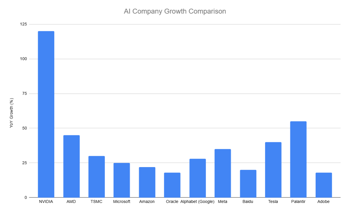
Bar chart showing AI company yearly growth comparison

Main takeaway

NVIDIA is a clear outlier at 120% growth, far above every other company in the dataset.

Why this chart works

Bars make rank differences obvious, so the viewer can instantly identify leaders and laggards.

Chart 2

Comparison of Market Capitalization Across Different Company Types

A doughnut chart grouped by type, useful for showing how the total market value is split between hardware, cloud, platform, and application firms.

Doughnut chart showing market capitalization across company types

Main takeaway

Hardware and platform firms hold the largest slices, suggesting that infrastructure and large-scale platforms dominate market value.

Why this chart works

The chart emphasizes share and composition rather than exact ranking, which makes the sector split easy to understand.

Chart 3

AI Sector Analysis: Market Cap vs. Growth & Penetration

A bubble chart that combines multiple variables at once: AI revenue share on the x-axis, yearly growth on the y-axis, bubble size for market cap, and color for company type.

Bubble chart showing AI sector analysis with market cap, growth, and revenue share

Main takeaway

NVIDIA stands out as the strongest overall outlier, combining high AI revenue share, high growth, and a very large market cap.

Why this chart works

The bubble chart lets one image show size, growth, penetration, and type, creating a richer argument than a simple two-variable graph.

Overall Conclusion

Taken together, the three charts tell a consistent story: a few AI companies dominate by market value, the industry is concentrated in hardware and platform players, and the fastest-growing firms are not always the largest. The bubble chart adds a deeper layer by showing that AI-heavy companies can combine scale and growth, but the pattern is not identical across all sectors. This makes the dataset suitable for a visual argument about how AI market power is distributed and where growth is happening.